Warner Hotels
Brand Identity
Creating space for
grown-up fun.
Warner Hotels has 16 unique locations across the UK, offering quality entertainment and activities, beautiful surroundings and dining, all wrapped into one price. Despite this, the brand had become associated with an old-school image and needed to appeal to a younger audience without alienating its loyal existing customers.
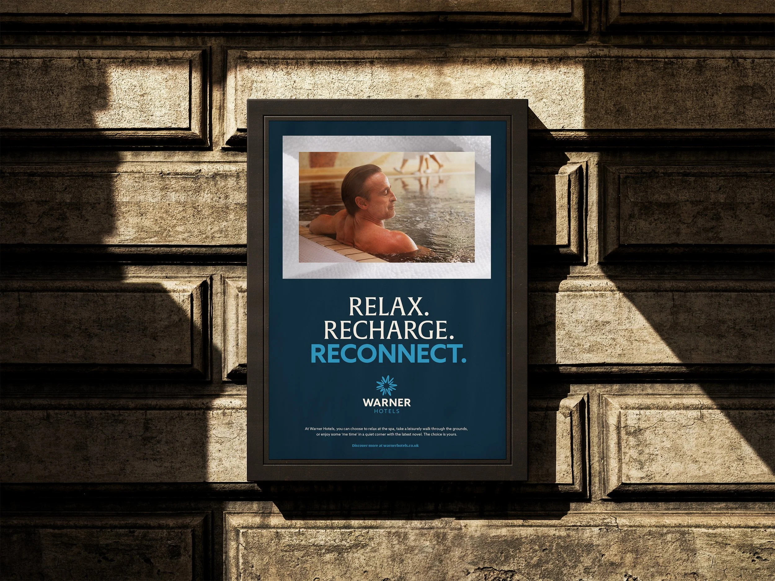
We repositioned Warner Hotels as a destination for grown up fun, a place to find joy, whether that means axe throwing with friends or simply relaxing by the pool. Across every brand touchpoint, we balanced sophistication with playfulness to create an identity that felt both fresh and familiar.
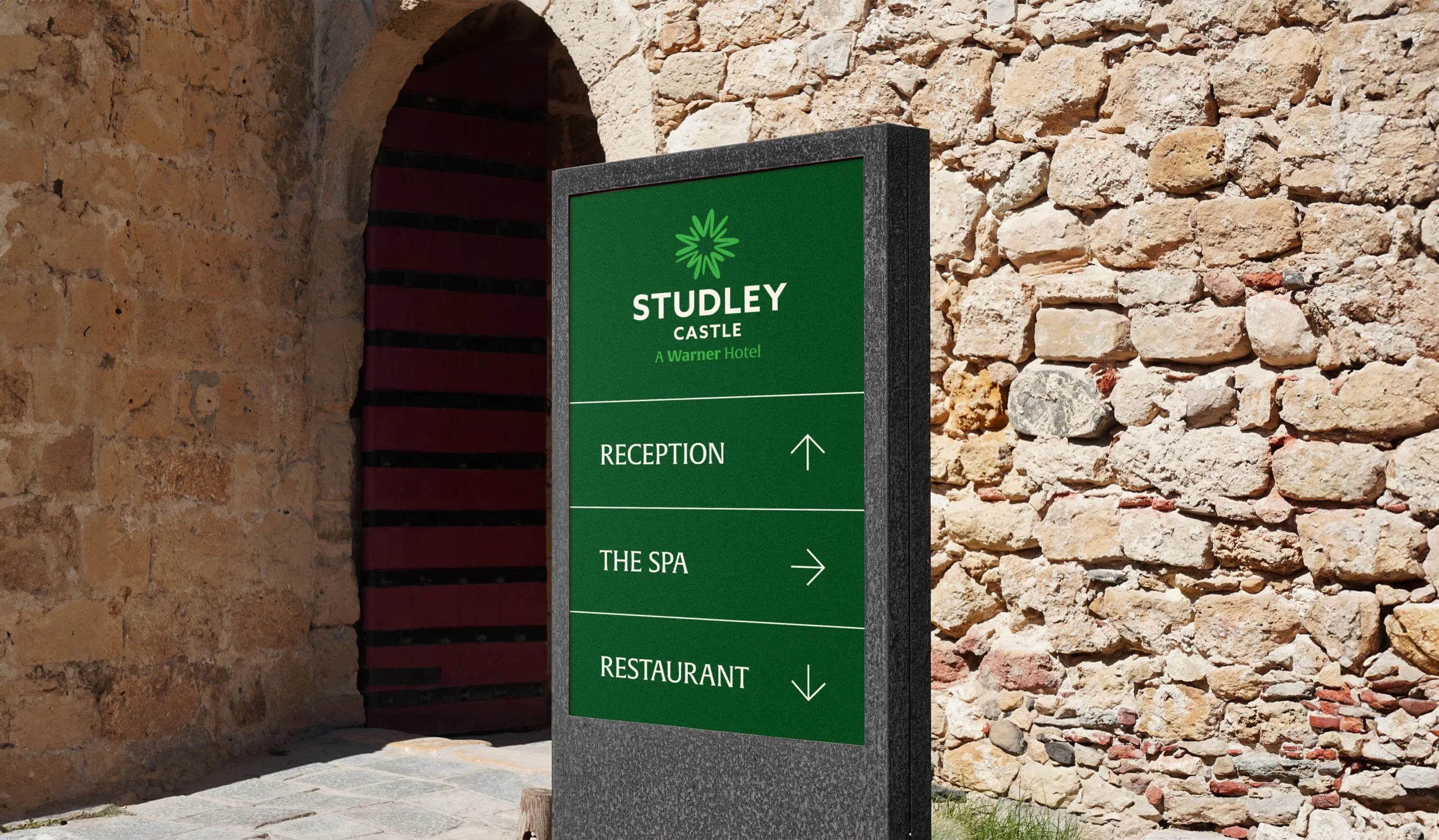
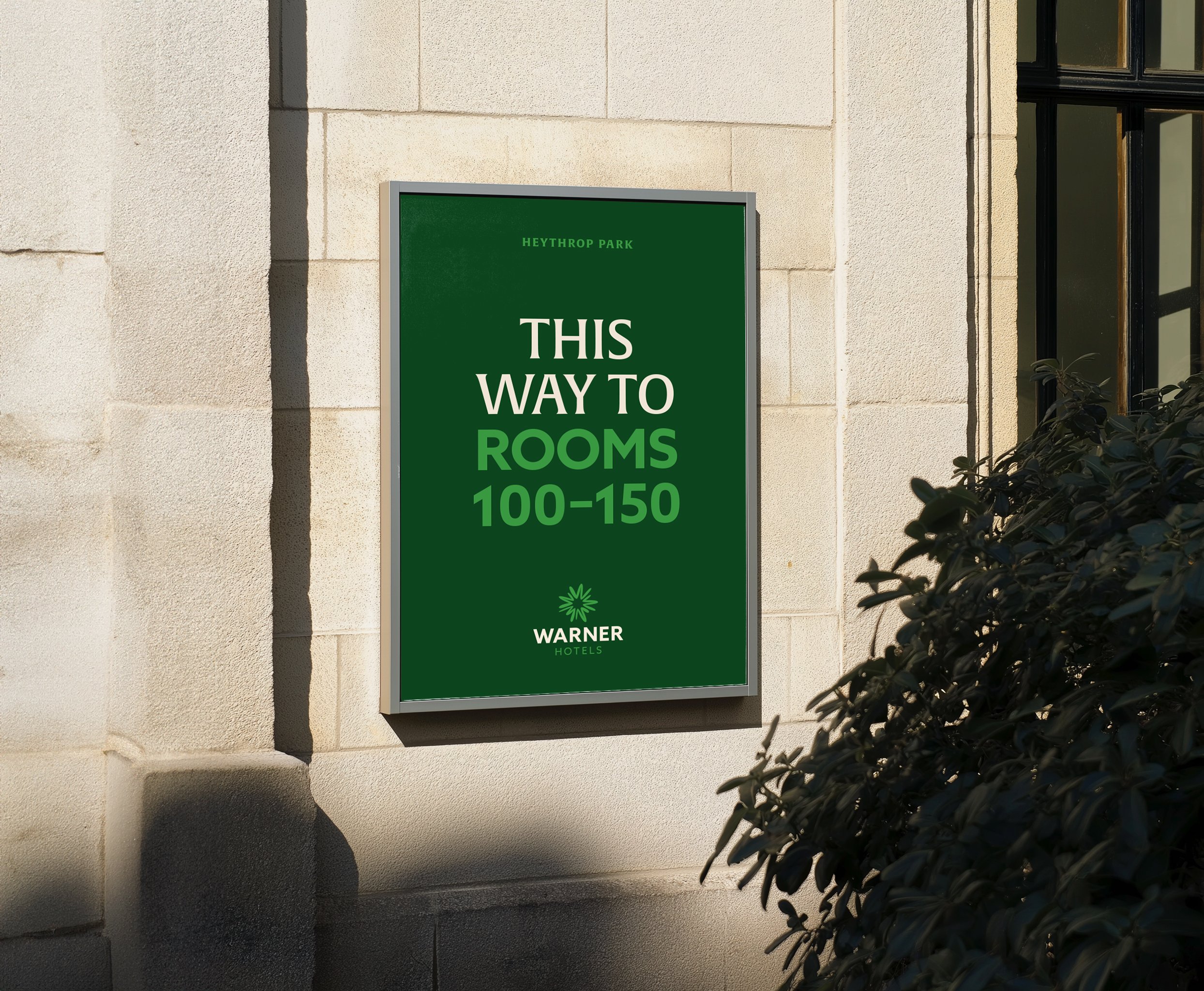
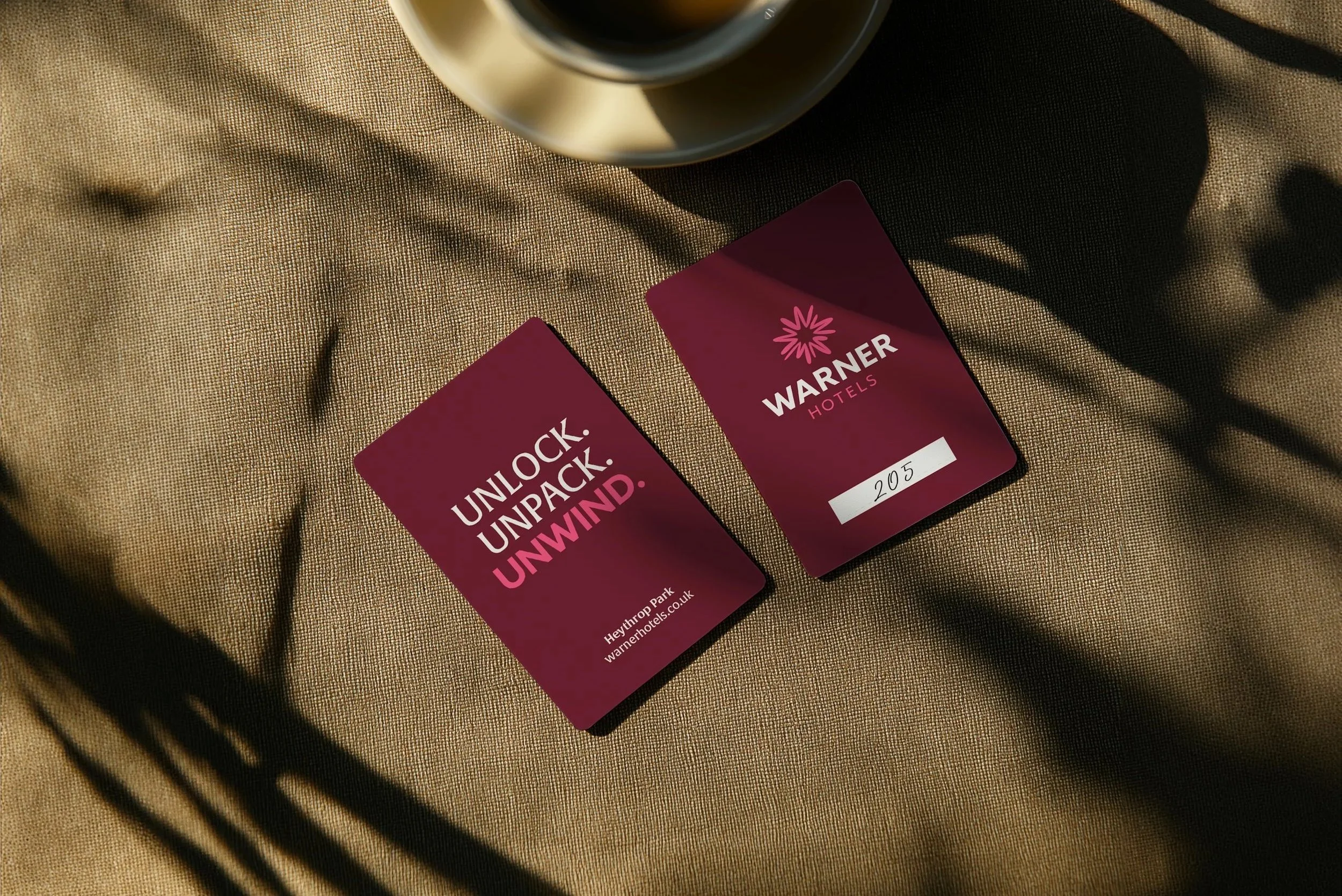
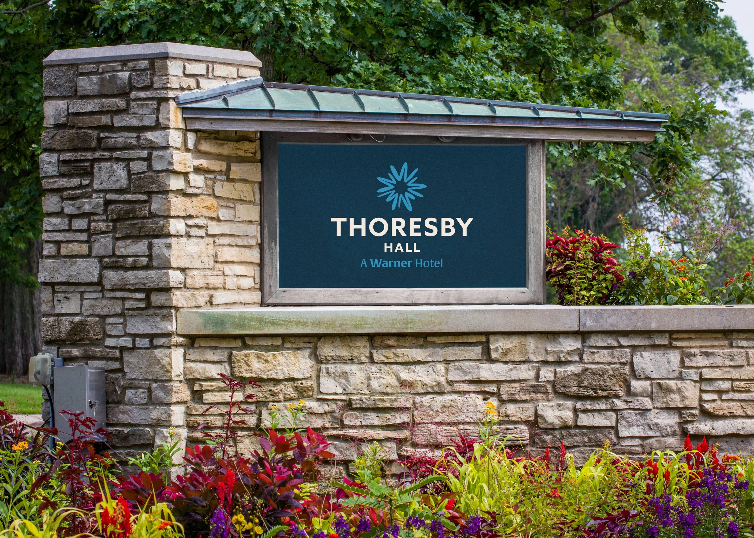
The logo uses a series of abstract ‘W’ forms to create a spark of joy, capturing the feeling of a Warner Hotels stay. A refined serif is paired with a bold sans serif, reinforcing the balance between grown up and fun, while the colour palette draws inspiration from the brand’s coastal and countryside locations.
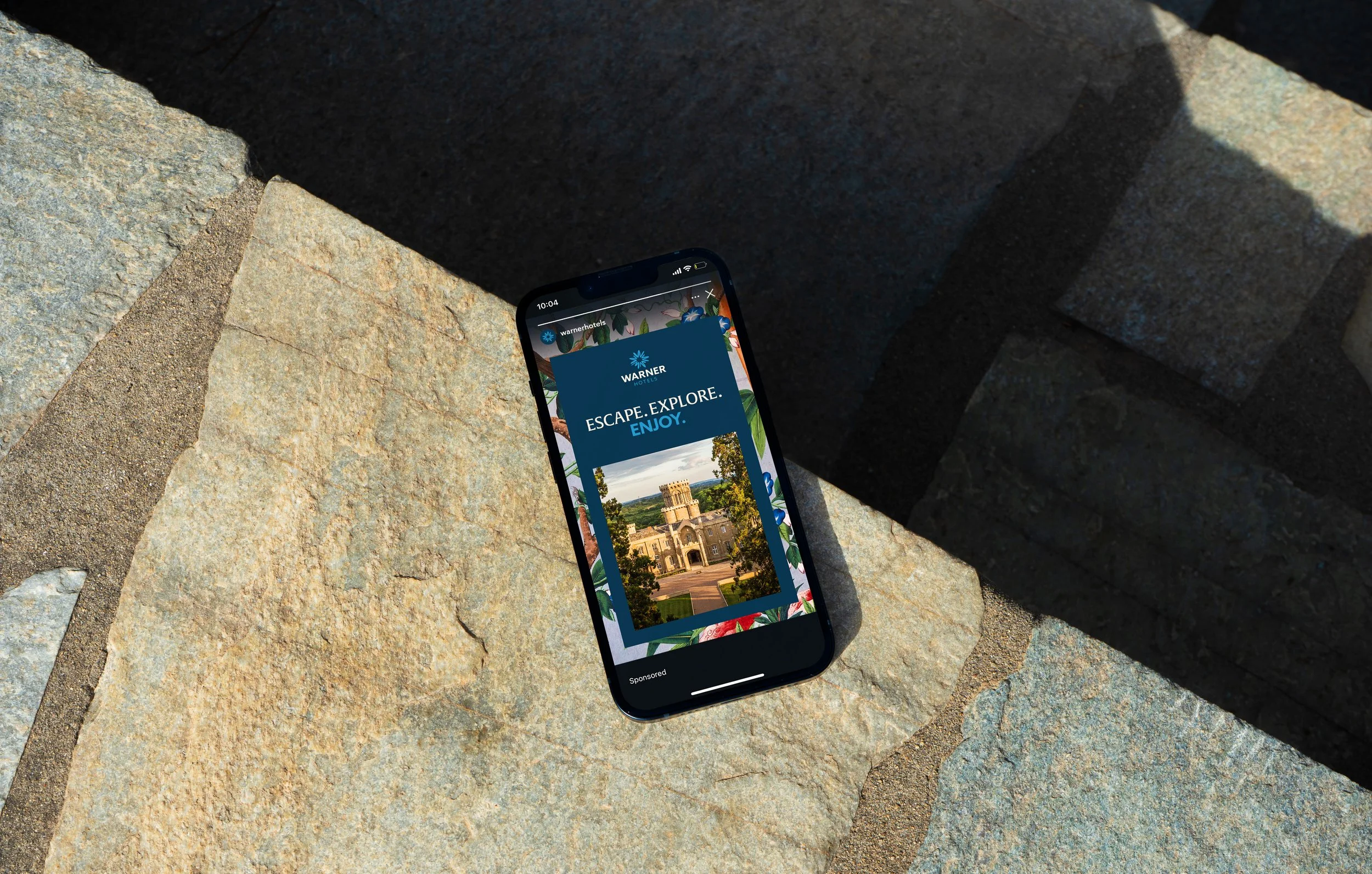
We also introduced a layered art direction that allowed the brand to showcase the breadth of its offering through overlapping imagery. The system could be used flexibly and tailored to each location, highlighting the experiences and environments unique to each hotel.
From the initial concept through to the nationwide rollout, I worked across every stage of the identity to ensure the final brand remained true to its original purpose: positioning Warner Hotels as a place for grown up fun.