One Eastside
Brand Identity
Rising above the city.
Rooted in its soul.
One Eastside, Birmingham’s tallest residential tower, offers luxury city living with an exceptional range of amenities. From private spas to rooftop bars, it’s designed to offer a lifestyle experience unlike anywhere else in the city.
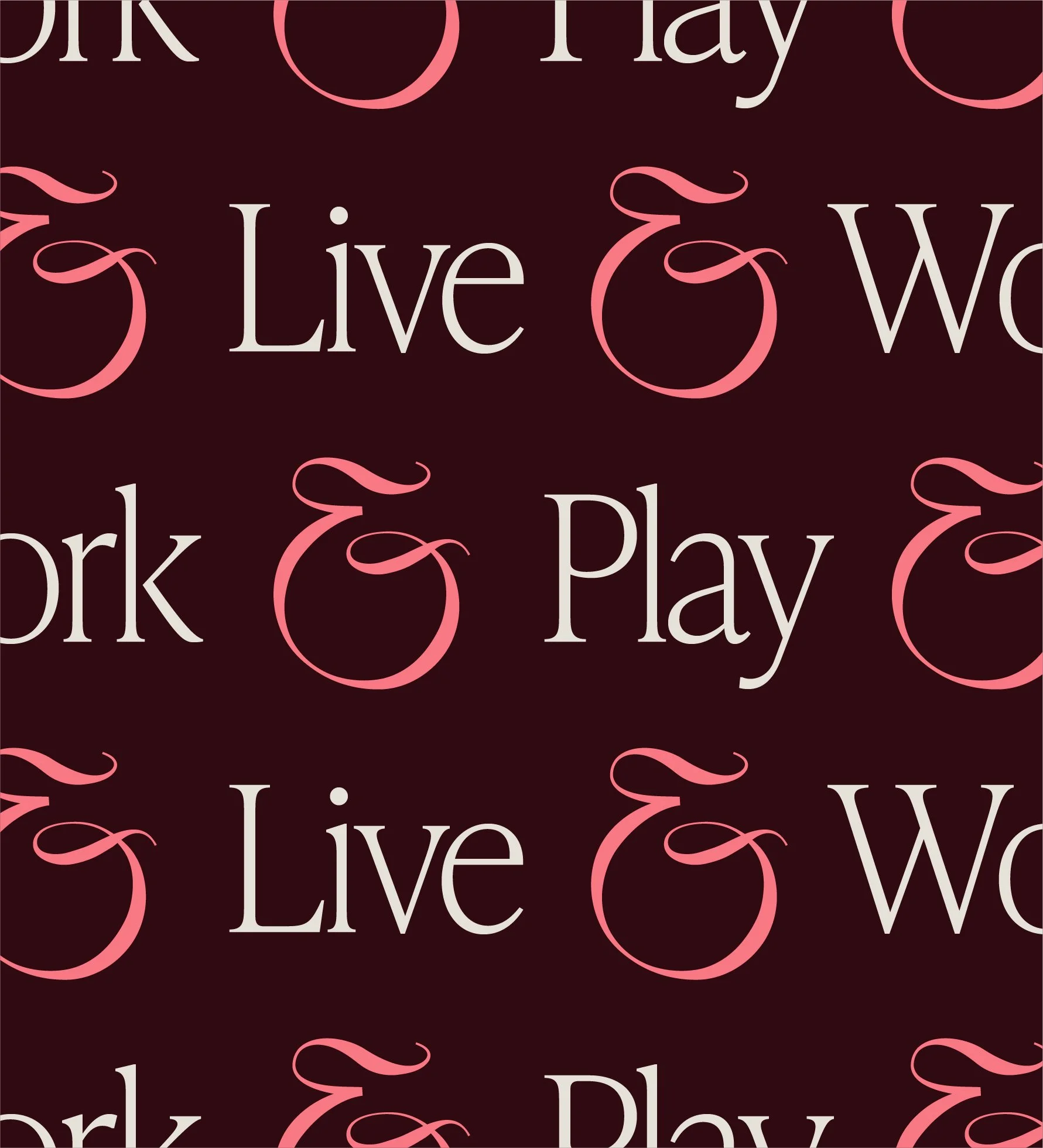
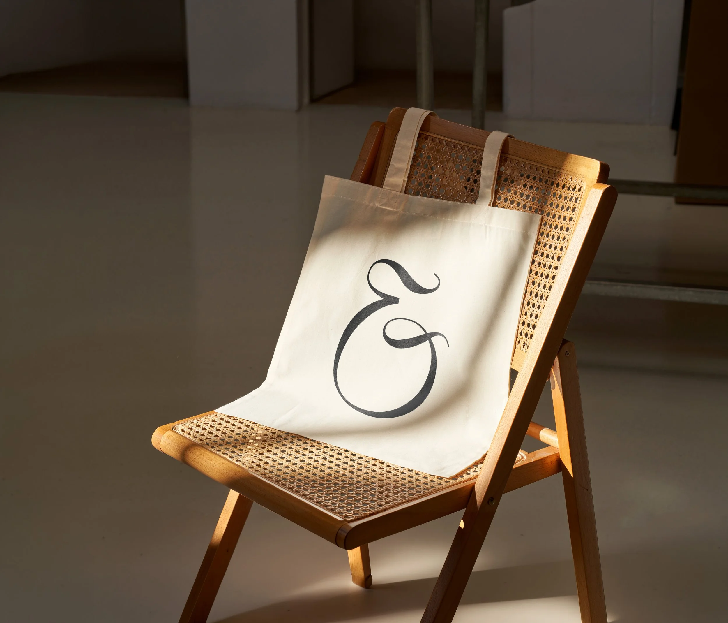
To capture this idea of enhanced living, I developed a simple ampersand brand mark constructed from the letters ‘OE’. This distinctive mark acted as the core idea for the brand identity, providing a simple and effective way to connect everything that One Eastside has to offer.
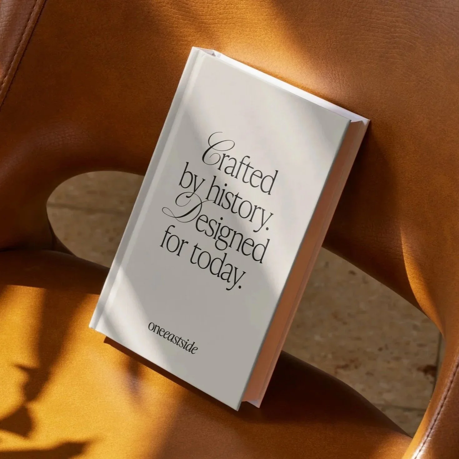
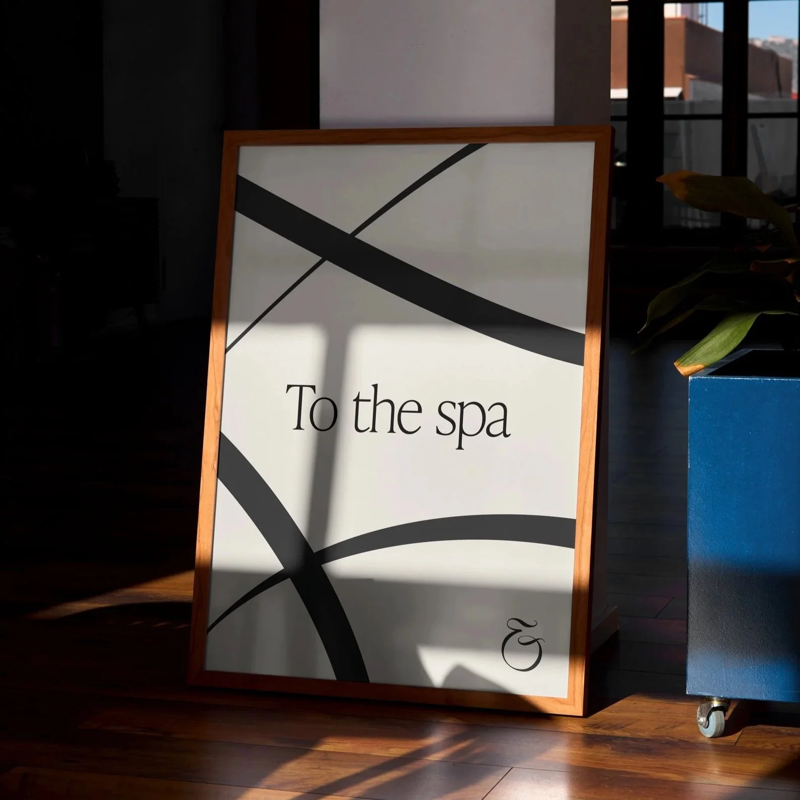
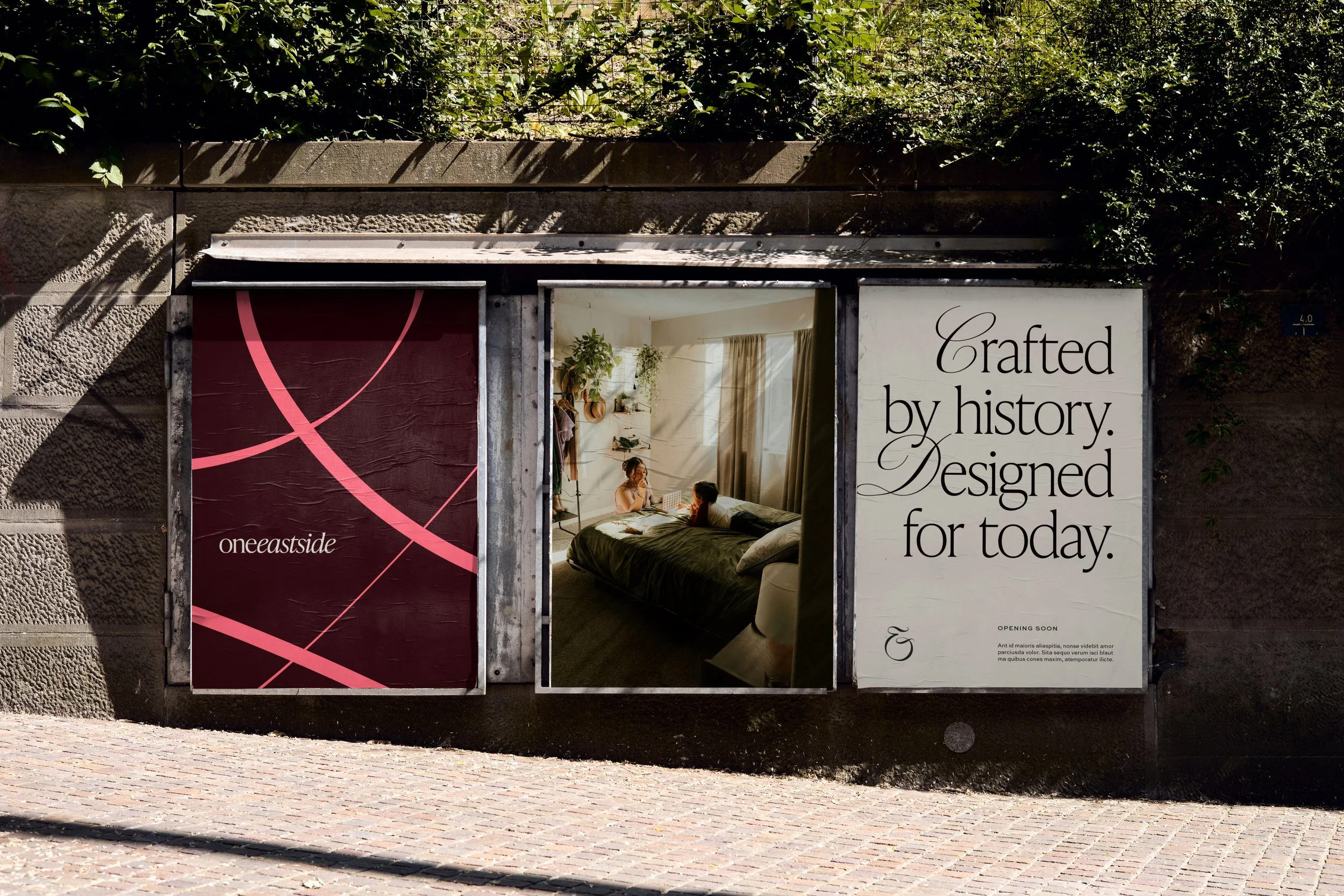
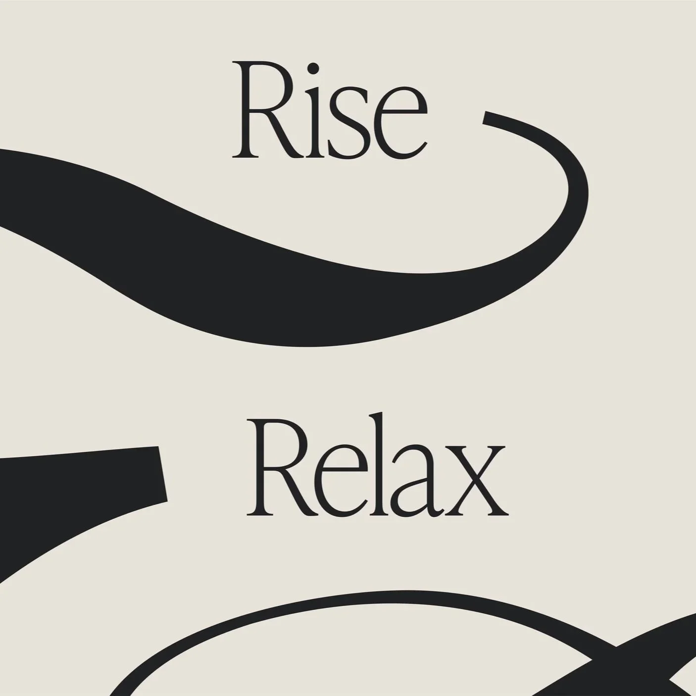
The building itself had been carefully designed to reflect Birmingham’s history and architecture, and this consideration was carried through into the wider identity system. Calligraphic touches in the typography and graphic language provide links back to Birmingham’s pen-making history, while also nodding to the stories yet to be written by those living in the building. The lead red colour is similarly reminiscent of the red-brick buildings seen throughout the city, as well as the prominent use of red brick within the building itself.